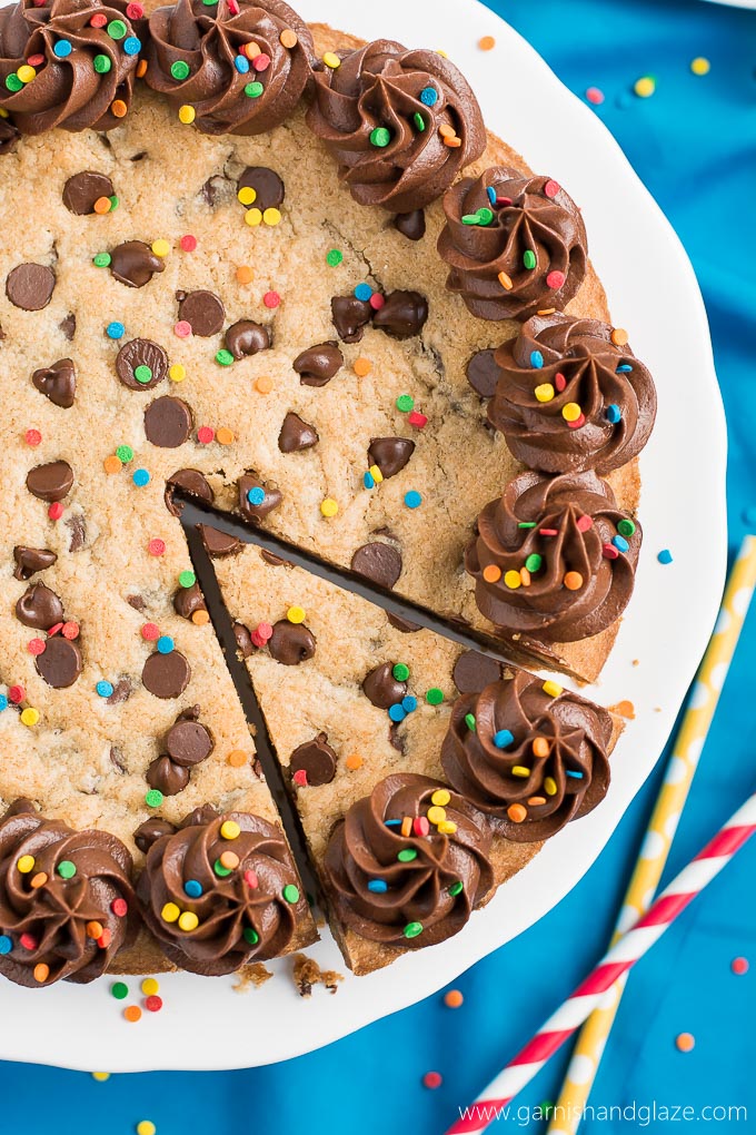
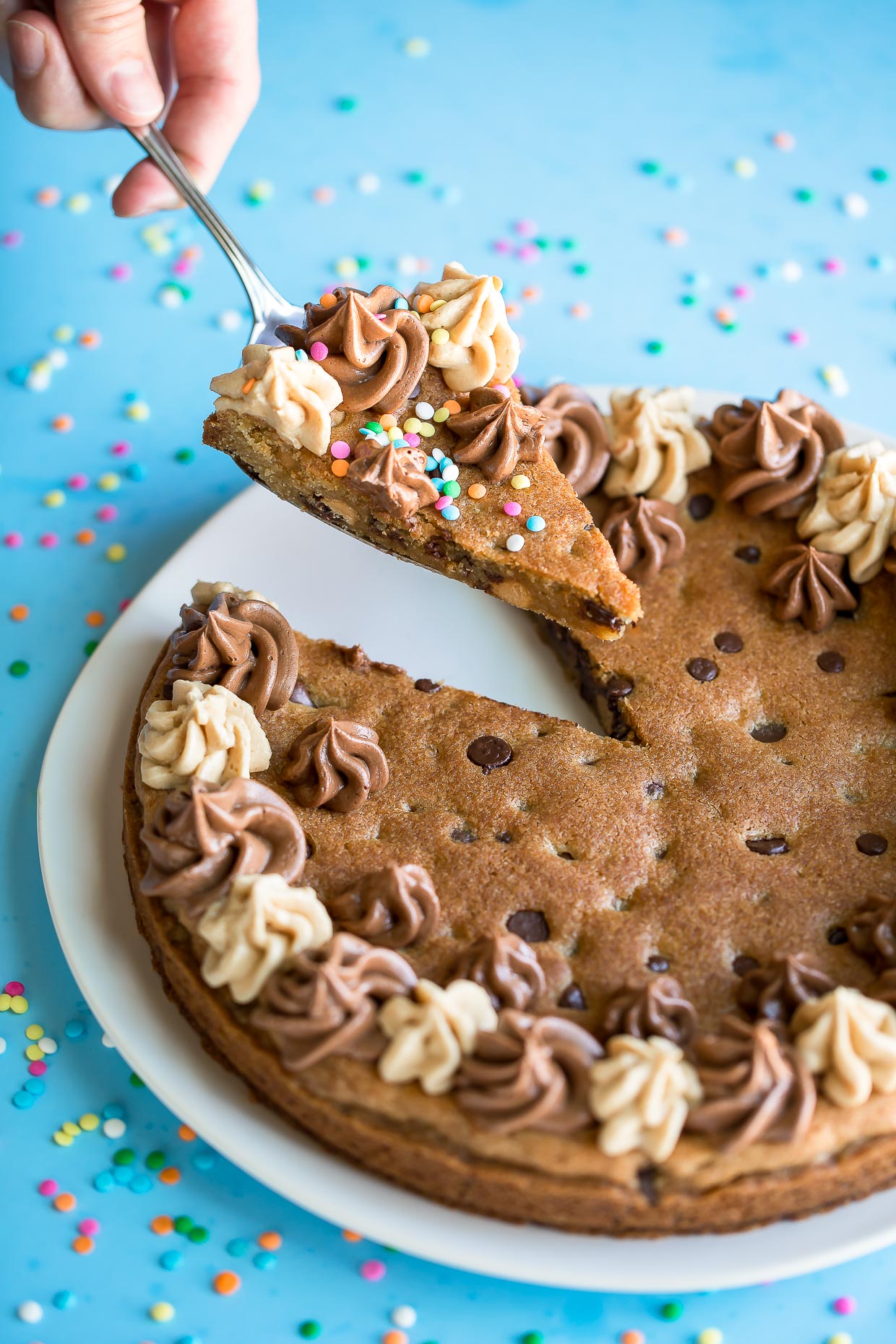
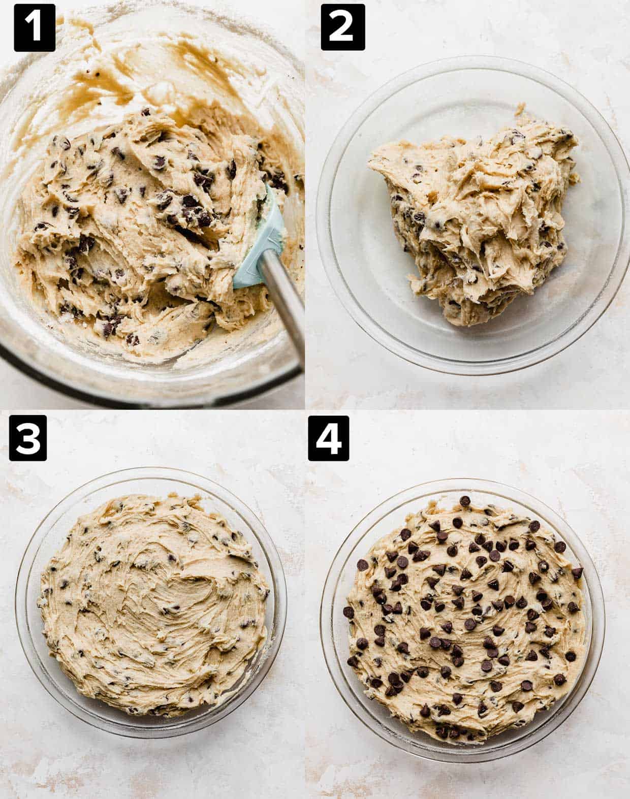
This cookie cake is perfect for birthday parties, get togethers, and customizable for any celebration. While your oven heats, decorate the cookie before baking, and once it cools, ice the cake however your heart desires.
Time
Special Notes
Ingredients
for the batter:
for the frosting
Instructions
Photo References


Recipe Website Examples
Tasty.com is a great website for beginner baker or cook due to the setup of their recipe pages. In three distinct columns, there are ingredients, instructions, and a video that is accessible and easy to understand. While this site has a minor issue with ad sizes and can feel overwhelming, it is easy to use and visually interesting to keep a potential user engaged.
Love and Lemons has a visually pleasing arrival page which feels comfortable, and it's simplicity makes the user feel comfortable and at home. When on the "recipes" page, it is cleanly organized and allows customization in looking for a recipe. This site is a great reference for setting clear columns and divisions between items and incorporation of images. Like Tasty.com, there is an uncomfortable number of ads, however, and there is a lot of introductory type before the recipe itself which is easily formatted in a separate box.
King Arthur Baking is my personal favorite website to use for baking for two primary reasons: clear hierarchy of information, and accessible links to buy necessary items for the recipe. The page attached is to a strawberry cake recipe, which includes photos and a description directly under the title along with general information about yield and time needed. Since this is from a baking company, in the Ingredients section there is a mini cart that will allow the user to buy components they can get directly from King Arthur Baking. For a user who may not be familiar with baking, this would be useful in the planning process.
Non-Recipe Websites
Max, or HBO Max has a great landing page in how it immediately gives recommendations with their latest content. I would like to incorporate this in some manner, in the sense of having a larger title with a supporting image. It also invites the user to scroll down by not having the title cover the entire page, which I would like to incorporate into my page, much like the King Arthur Baking website.
Ed Sheeran's artist page is interactive, well laid out, and is organized in a way that is visually interesting but clear in which aspect of the site the viewer is interacting with. I really enjoy the animations he uses for the opening page to advertise his album. I would like to have some interactive or moving element in my site in a subtle manner like this.
Leigh Bardugo's website showcases her bibliography in a distinct but interesting manner through a cohesive color scheme and limited values outside of her book covers. This is something I would like to incorporate since I don't want my page to appear overwhelming when conveying my recipe's information.